
If you’ve spent any time online following artists, podcasters, YouTubers, writers, musicians, or creators of any kind, you’ve probably seen the Patreon logo countless times.
It’s often tucked away beneath a video, displayed on a creator’s website, or featured in a social media bio with a simple message: “Support me on Patreon.”
But have you ever stopped to think about the logo itself?
I recently found myself going down one of those internet rabbit holes where a quick search turned into an hour of reading about branding, design choices, and company history. Somewhere along the way, I became fascinated by the Patreon logo and how such a simple design became one of the most recognizable symbols in the creator economy.
What’s interesting is that the logo isn’t flashy. It doesn’t rely on complicated graphics, gradients, or trendy effects. Yet millions of people instantly recognize it.
In this article, we’ll explore the history of the Patreon logo, its evolution, design philosophy, symbolism, branding impact, and why it works so well in today’s digital world.
Whether you’re a graphic designer, creator, marketer, or simply curious about logos, there’s actually a lot to learn from Patreon’s visual identity.
What Is Patreon?
Before diving into the logo itself, it’s worth understanding what Patreon actually is.
Patreon is a membership platform that allows creators to receive recurring financial support from fans. Instead of relying solely on advertising revenue, sponsorships, or one-time purchases, creators can offer exclusive content and perks to supporters in exchange for monthly memberships.
Founded in 2013 by musician Jack Conte and developer Sam Yam, Patreon quickly became one of the most influential platforms in the creator economy.
Today, creators across numerous industries use Patreon, including:
- YouTubers
- Podcasters
- Artists
- Writers
- Musicians
- Educators
- Streamers
- Animators
As the platform grew, the Patreon logo became increasingly visible across the internet.
Why the Patreon Logo Matters
Many people underestimate the power of a logo.
A logo isn’t just a decorative graphic. It’s often the first thing people associate with a brand.
Think about some of the world’s most recognizable logos:
- Apple
- Nike
- McDonald’s
- YouTube
- Spotify
The Patreon logo serves a similar purpose.
Whenever creators display it, audiences immediately understand that it’s connected to memberships, creator support, exclusive content, and community engagement.
That level of recognition is incredibly valuable.
The Early Patreon Logo
When Patreon launched, its original branding was fairly simple.
Like many startups, the company focused more on functionality and growth than on creating a timeless visual identity.
The earliest logo versions included text-based elements that clearly communicated the brand name but didn’t necessarily stand out in a crowded digital landscape.
As Patreon expanded, the company realized it needed a stronger visual identity that could scale globally.
The challenge was creating a logo that reflected creativity while remaining clean and modern.
The Major Patreon Rebrand
One of the most significant moments in the company’s visual history came when Patreon introduced its redesigned logo and branding system.
At first glance, some users thought the change was almost too simple.
But that’s often what happens with successful logo redesigns.
People are accustomed to seeing the old version, and simplicity can sometimes be mistaken for lack of effort.
In reality, simplifying a logo is often much harder than making it more complex.
Patreon embraced minimalism and created a visual identity that felt modern, flexible, and creator-focused.
Understanding the Current Patreon Logo
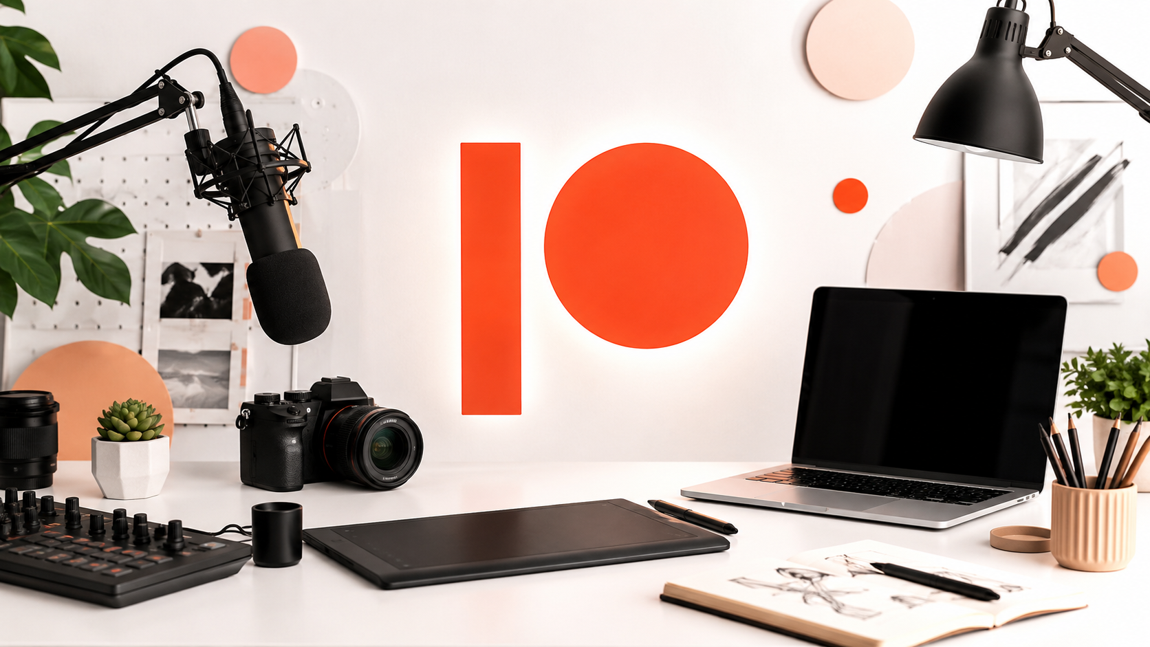
The modern Patreon logo consists of two primary elements:
The Circle
The circular shape is perhaps the most noticeable feature.
It’s bold, simple, and instantly recognizable.
Circles often symbolize:
- Community
- Unity
- Creativity
- Inclusion
- Continuity
These themes align surprisingly well with Patreon’s mission.
The platform is fundamentally about communities supporting creators.
The Vertical Bar
Next to the circle sits a vertical bar.
This element balances the composition and creates a distinctive visual structure.
Together, the shapes create a minimalist symbol that feels modern without becoming trendy.
The Meaning Behind the Design
One reason the Patreon logo has remained successful is that it allows multiple interpretations.
Some people see abstract creativity.
Others see progress and forward movement.
Some view it as a representation of creators and supporters working together.
The best logos often leave room for interpretation.
They communicate an idea without spelling everything out.
Patreon achieved exactly that balance.
Why Simplicity Wins
I’ve always been fascinated by simple logos.
When I first started blogging, I assumed great logos needed intricate illustrations and impressive effects.
Then I noticed something.
Many of the world’s most successful brands use surprisingly simple designs.
The Patreon logo follows this principle perfectly.
Simple logos offer several advantages:
Better Recognition
People remember simple shapes faster.
Easier Scalability
The logo works on:
- Websites
- Mobile apps
- Social media profiles
- Merchandise
- Business cards
Stronger Branding
A simple symbol becomes easier to associate with a brand over time.
Patreon understood this concept exceptionally well.
The Color Choice of the Patreon Logo
Color plays a huge role in branding.
Patreon’s signature color palette includes a distinctive coral-orange tone.
This color stands out from competitors while maintaining a friendly and approachable feel.
Orange often communicates:
- Creativity
- Energy
- Enthusiasm
- Optimism
Those qualities fit naturally with a platform built around creators.
The color feels warm rather than corporate.
That’s an important distinction.
How the Logo Supports the Creator Economy
The rise of Patreon coincided with the growth of the creator economy.
Millions of people began building audiences online and looking for ways to monetize their work independently.
The Patreon logo became a visual shortcut for a new type of business model.
Instead of traditional employment structures, it represented:
- Direct audience support
- Independent creativity
- Community funding
- Sustainable content creation
Over time, the logo became associated with creator freedom.
That’s a powerful branding achievement.
Why Creators Display the Patreon Logo Everywhere
Have you noticed how frequently creators display the Patreon logo?
There are practical reasons for that.
Instant Recognition
Most internet users already understand what Patreon is.
Trust
The logo signals a legitimate platform.
Conversion
Recognizable logos often improve user confidence and engagement.
When supporters see the Patreon logo, they already know what to expect.
That reduces friction.
The Psychology Behind the Logo
Good logos work because they tap into human psychology.
The Patreon logo uses several principles that designers frequently discuss.
Visual Balance
The shapes create harmony without feeling overly symmetrical.
Minimal Cognitive Load
Viewers understand the logo quickly.
Distinctiveness
Few major brands use a similar combination of shapes.
Memorability
The design remains recognizable after only a few exposures.
These factors contribute significantly to its success.
Comparing the Patreon Logo to Other Tech Brands
It’s interesting to compare Patreon with other modern technology companies.
Many tech brands initially embraced complicated logos before simplifying them.
Examples include:
- Airbnb
- Uber
- Spotify
- Dropbox
Patreon followed a similar path.
The trend toward minimalism isn’t accidental.
Digital-first companies need logos that perform well across countless screen sizes and platforms.
The Patreon logo excels in this environment.
What Designers Can Learn from the Patreon Logo
Even if you’re not designing a billion-dollar platform, there are valuable lessons here.
Focus on Function
A logo should work before it impresses.
Remove Unnecessary Elements
Complexity isn’t always sophistication.
Think Long-Term
Trendy design choices often age poorly.
Prioritize Recognition
Being memorable matters more than being flashy.
The Patreon logo demonstrates all of these principles.
Common Criticism of the Patreon Logo
Not everyone loved the redesign.
Whenever a major brand changes its visual identity, criticism is inevitable.
Some users argued that:
- The logo felt too abstract.
- It lacked personality.
- It seemed overly minimal.
These reactions are common.
In fact, many famous logos faced criticism when first introduced.
Over time, familiarity usually changes public perception.
Today, most users recognize the Patreon logo instantly.
That’s ultimately what matters.
How the Logo Works Across Different Platforms
One thing I appreciate about the Patreon logo is its flexibility.
Whether you’re viewing it on:
- A smartphone
- A desktop browser
- A YouTube channel
- A podcast page
- A creator website
It remains clear and recognizable.
This adaptability is crucial in modern branding.
Many logos look great in one environment but struggle elsewhere.
Patreon’s design avoids that problem.
The Role of Branding in Patreon’s Growth
It’s impossible to attribute Patreon’s success solely to its logo.
The platform’s growth came from its services, creator relationships, and market timing.
However, branding absolutely contributed.
A strong visual identity helps users:
- Remember a brand
- Trust a platform
- Recognize it instantly
The Patreon logo became a visual ambassador for the company’s mission.
Every time creators shared it, the brand gained additional visibility.
Why the Logo Feels Modern Years Later
One challenge in branding is creating something that won’t feel outdated within a few years.
Many logos become tied to specific design trends.
Patreon largely avoided that trap.
The logo remains modern because it relies on:
- Basic geometric shapes
- Clean lines
- Strong contrast
- Simple composition
These elements tend to age gracefully.
The Future of the Patreon Logo
Will the Patreon logo change again?
Probably.
Most major brands eventually evolve.
However, dramatic redesigns seem unlikely in the near future.
The current logo has achieved strong recognition and aligns well with the company’s identity.
Future updates would likely involve refinement rather than reinvention.
That’s usually a sign of successful branding.
What Makes the Patreon Logo Iconic?
When I think about why the Patreon logo works so well, several factors stand out.
It’s:
- Simple
- Memorable
- Scalable
- Distinctive
- Flexible
- Meaningful
Those characteristics are surprisingly difficult to combine in a single design.
Yet Patreon managed to do exactly that.
The result is a logo that feels both modern and timeless.
Final Thoughts
The Patreon logo is a great reminder that effective branding doesn’t require complexity.
In an online world filled with visual clutter, simplicity often stands out more than elaborate design.
What started as a small platform helping creators earn recurring income has grown into one of the defining brands of the creator economy. Along the way, the Patreon logo evolved into a symbol recognized by millions of people across the internet.
Whether you’re a designer looking for inspiration, a creator building your own brand, or simply someone curious about logo design, Patreon offers an excellent case study in modern branding done right.
The next time you see that familiar circle and vertical bar beneath a YouTube video or podcast description, you’ll know there’s a lot more history and strategy behind it than meets the eye.
FAQs About the Patreon Logo
What does the Patreon logo represent?
The Patreon logo represents creativity, community, and support between creators and their audiences. Its minimalist design reflects the platform’s mission of helping creators build sustainable income through memberships.
Why did Patreon change its logo?
Patreon updated its branding to create a stronger, more recognizable identity that could scale globally and work effectively across digital platforms.
What color is the Patreon logo?
The Patreon logo is known for its distinctive coral-orange color, which communicates creativity, energy, and enthusiasm.
Who designed the Patreon logo?
Patreon worked with branding and design professionals during its rebranding process to create a modern visual identity aligned with its growing role in the creator economy.
Is the Patreon logo copyrighted?
Yes. The Patreon logo is a protected trademark and brand asset owned by Patreon. It can only be used according to Patreon’s branding guidelines.
Why is the Patreon logo so simple?
The simplicity improves recognition, scalability, and usability across websites, apps, social media, and creator content.
Has the Patreon logo changed multiple times?
Yes. Like many technology companies, Patreon has evolved its branding over time, moving toward a cleaner and more minimalist visual identity.
Why is the Patreon logo recognizable?
Its unique geometric shapes, strong color palette, and widespread visibility across creator platforms have made it highly recognizable to internet users worldwide.
